|
|
|
|
|
Rules List
The first loaded page is the Rules List page, containing a sort-able table with the UID and name of the rules, their status, description, tags and actions. Filtering widgets are not visible if no rules are available in the system. Using the buttons in the actions column, each rule can be enabled/disabled, edited removed or run. In the top right corner there are buttons for creating a new rule and for reloading the rules list. When a rule is added, removed or updated, a corresponding message will be shown in the yellow status line.
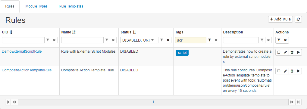
To sort by column, click on the column title, if an icon with arrows is placed next to it. To filter rules by a rule property, write the filtering text in the corresponding field or choose from the drop-down menu, then click on the  (filter) button or press Enter. When the rules are filtered by column, its filter button will become lighter, which means it is disabled. To clear an applied filter, press the X button. The actions column has two buttons –
 that applies all filters at once and  that clears all filters at once. Status descriptions, if any, can be viewed as a tooltip.
Create Rule
Pressing  will open a window for creating a rule. By using the corresponding radio button the rule can be created either by template or by modules.
In the left section the user fills in the general rule details like UID, name, description, tags and visibility.
After all required properties are filled, the  button will be enabled, and when clicked, the rule will be created and the first page with rules list will be loaded. If there is an error with the creation of the rule, the user can correct the data and try to create the rule again.
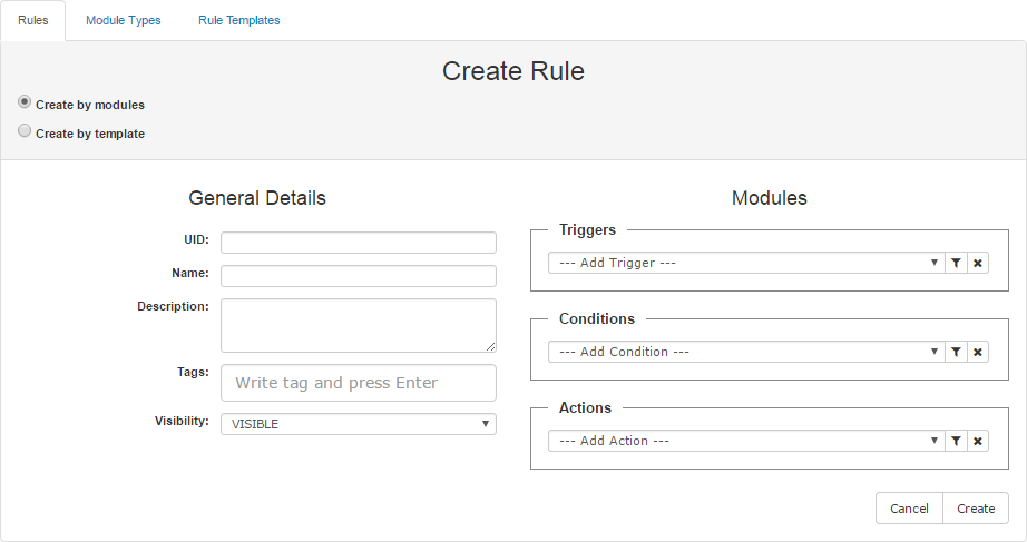
Create Rule by Modules
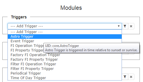
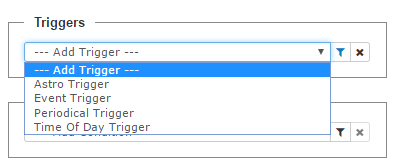
Clicking on the first radio button will cause the Modules section to appear(this is the default loaded screen) with module types(Triggers, Actions and Conditions) loaded in the corresponding combo-boxes. Every module type's UID and description can be viewed via its tooltip. Each module type in the combo-boxes is represented with its type, label, outputs and its description is visible as a tooltip of the element. Use the  button for adding a new module. If no trigger is added yet, the buttons for adding a condition and action are disabled.
Module Types can be filtered in each section by using the button, which opens a dialog. This combo-box presents a filtering option by UID, Label or Tags
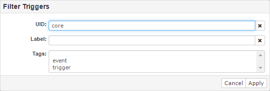
Tags is a multi-select section that can be filled with tags of Module Types. After a filtering section is filled, press the Apply button. The dialog will be closed and the combo-box will contain only the filtered module types.
When the Module Types are filtered the filter icon is blue as seen above. Using the button will clear the filter and all Module Types will be shown again.
To add a new module in the rule, simply choose Module Type and the dialog will be opened.
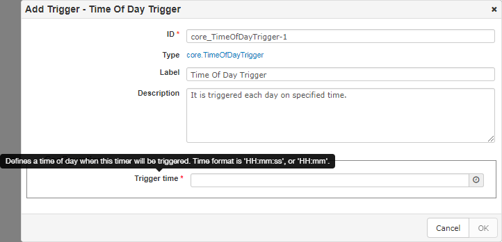
The Add dialog contains Label and Description fields with values that come from the selected Module Type. The ID of the module is mandatory and is autofilled with <module_type_uid>-<index>. Type shows the Module Type UID, which is also a link to the Module Type view page. All required fields are marked with a *.
When a Module Type contains configDescriptions, the properties are listen in the Configurations section. Each property is represented by its label e.g. "Trigger time", and its tooltip shows its description.
Adding a Trigger
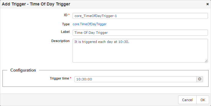
After all the necessary fields are filled in, the OK button will be enabled and the Trigger may be added.
The newly created module will be shown at the bottom of the current section. It can be removed by using the button. The module ID is used as a title, while the module description can be seen in its tooltip.
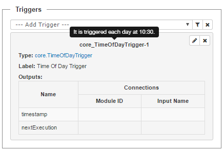
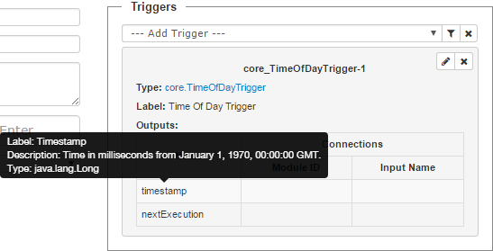
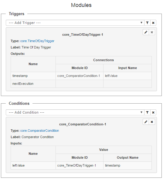
The Module might contain a table for Outputs. Each Output is represented by it's name and the corresponding tooltip contains it's label, description and type.
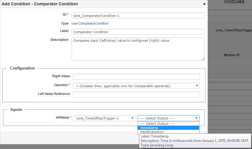
Adding Condition
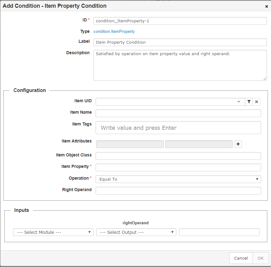
A section Inputs will appear if that specific module type has inputs. In it a corresponding output variable can be chosen for every input. Each input is represented with it's name and the tooltip contains it's label, description and type.
To connect the input from the first combo-box, please select:
The screenshot bellow shows an example of an added condition.
A module whose output is used as input, cannot be removed. In this scenario the button is disabled.
The Connections table will be filled for used outputs. All elements in the Inputs and Outputs tables have tooltips that contain their label, description and type.
Adding an Action
Adding an Action is handled in the same way as the previous modules.
The screenshot bellow shows an example of adding a "FI Property Action".
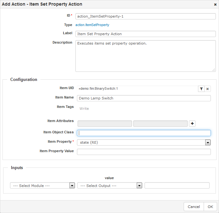
The screenshot bellow shows an example of adding a "FI Property Action".
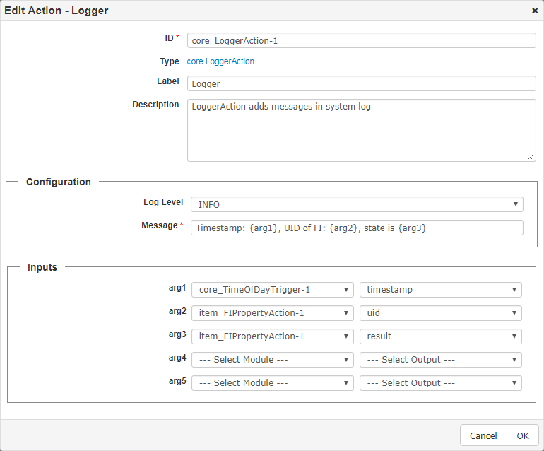
The screenshot bellow shows the added "FI Property Action" and "Logger" actions. The Outputs fields are updated and the button for removing a module is disabled.
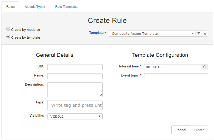
Create Rule by Template
Clicking on the second radio-button will cause a combo-box with templates to appear on the right side, choose a template and fill its configuration.The Create button will be enabled, after all required fields are filled. Clicking the Create button will create the rule and the Rules List page will be loaded. If an error occurs it will be shown, so the user can correct their data and retry.
Edit Rule
Every listed rule can be edited by using the  button on the right side of the Rules list tab.
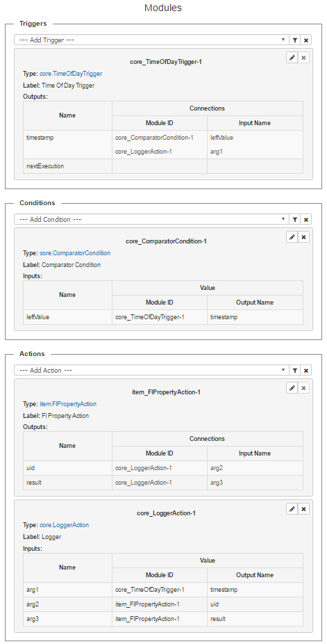
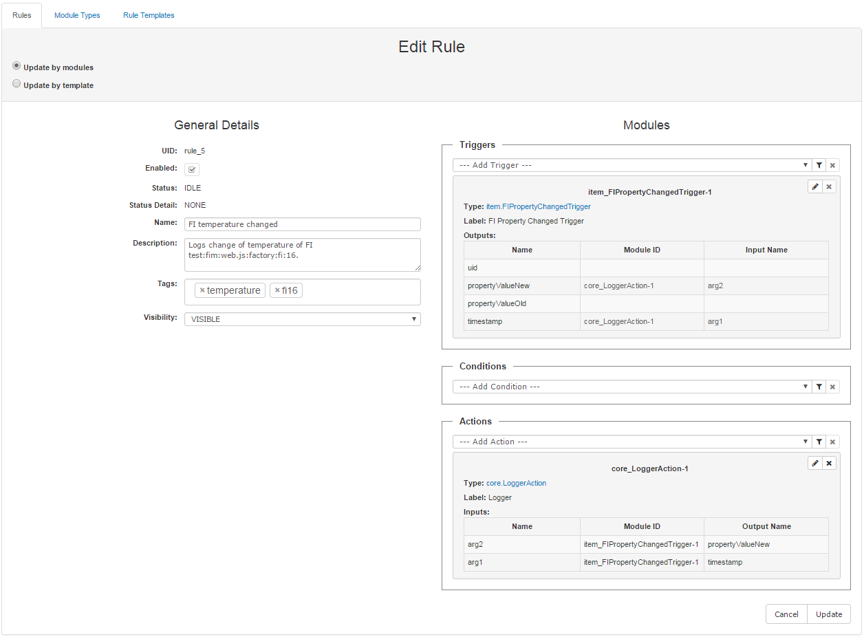
The screenshot bellow shows an example of a rule, created by modules.
The screenshot bellow shows an example of a rule, created by template.
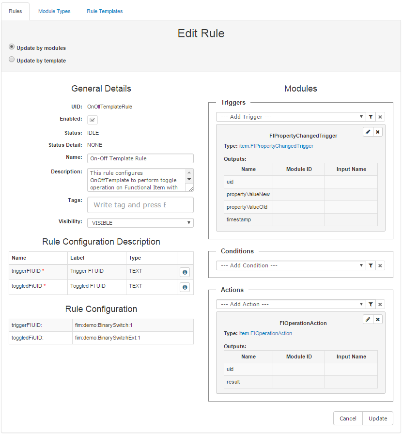
When a rule is created by a template, the following tables appear:
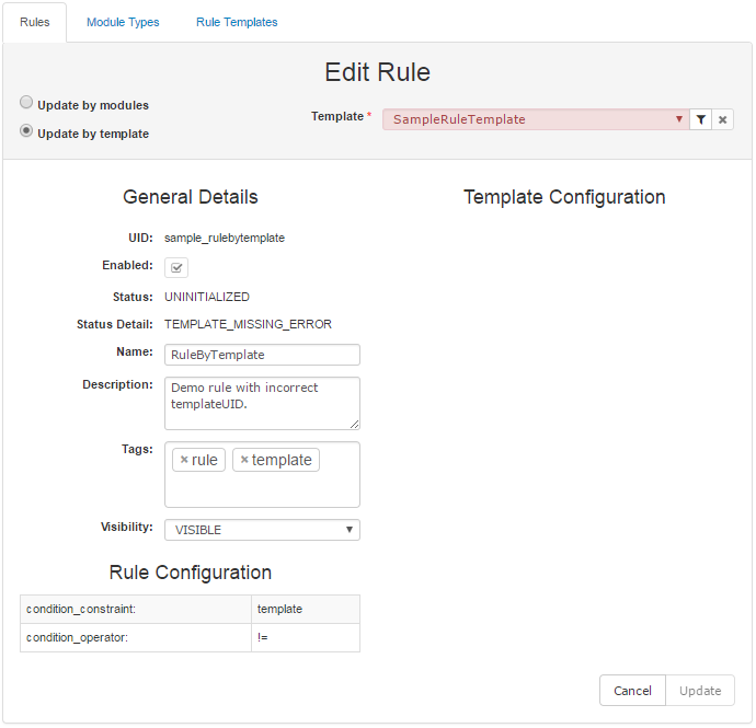
When a rule is created by a non existing template, the corresponding template UID is visible in the combo-box with templates, but is colored in red(as seen in the example bellow), the rule is UNINITIALIZED and the Update button is disabled. In this case another template needs to be chosen.
Rule Actions
The possible actions are situated in the column on the far right.
Removing a Rule
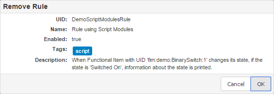
Removing a rule can be done by using the  button. A new window will appear prompting for confirmation.
Enable/Disable Rule
To enable/disable a rule, check/uncheck the checkbox  in the Actions column. The checkbox shows whether a rule is enabled or disabled.
Run Now a Rule
To execute the actions in the rule immediately use the Run Now button  .
.
Editors for Configuration Property
When adding or editing a module, the user often has to fill various configuration properties depending on the corresponding module type. Depending on the property context there are several editors:
Context |
Editor |
Send Data |
|---|---|---|
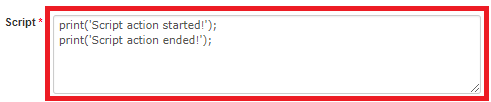
multiline |
Used when the property has type TEXT, but would like to use a text area instead of a text field |
print('Script action started!'); \nprint('Script action ended!'); |
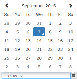
date |
Using Bootstrap 3 Datepicker v4 |
format: 'YYYY-MM-DD' example: "2018-01-11" |
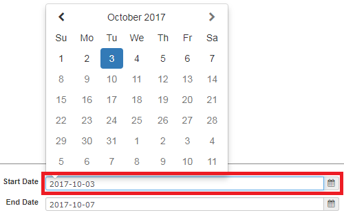
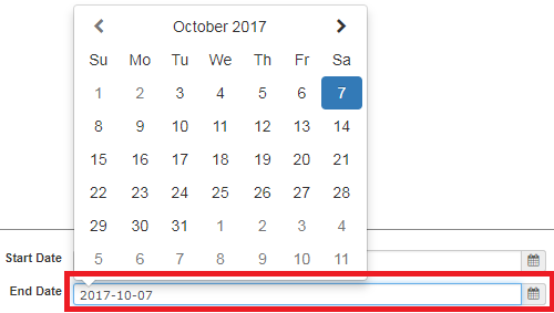
date start date end |
When two properties with date context are required, the first one should be the starting point and the second should be the end point. In these circumstances the first date, should be before the second one.
When filling the starting date, the days after the end date are disabled.
When filling the finishing date, the days before the start date are disabled. |
|
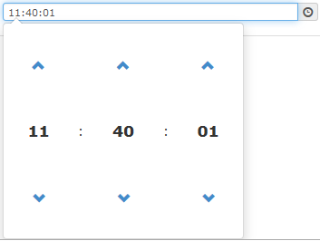
time |
Using Bootstrap 3 Datepicker v4 |
format: 'HH:MM:SS' example: "11:40:01" |
time start time end |
When two properties with time context are required, the first one should be the starting point and the second should be the end point. In these circumstances the first time, should be before the second one. The user interfaces are similar to the date start/end property. Similar to that, when selecting the start time, time after the end time cannot be chosen, and the opposite. |
|
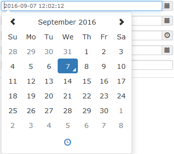
datetime |
Using Bootstrap 3 Datepicker v4 |
format: 'YYYY-MM-DD HH-:mm:ss' example: "2018-01-12 12:02:12" |
datetime start datetime end |
When two properties with date/time context are required, the first one should be the starting point and the second should be the end point. In these circumstances the first date and time, should be before the second one. The user interfaces are similar to the date start/end property. Similar to that, when selecting the start date/time, date/time after the end date/time cannot be chosen, and the opposite. |
|
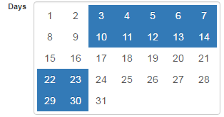
days |
Days from the 1st to the 31st can be selected by dragging a box with the mouse over the elements. These elements can be also selected via click or dragging while holding the ctrl/meta key.
|
example: [3, 4, 5, 6, 7, 8, 9, 10, 11, 12, 13,14, 22, 23, 29, 30] |
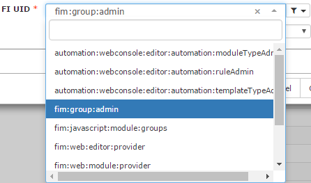
item.uid |
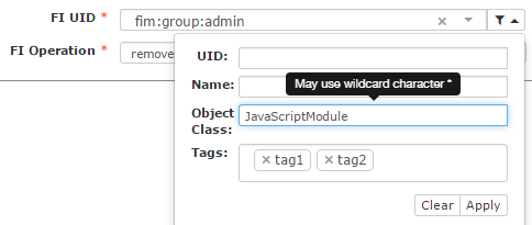
|
example: fim:group:admin |
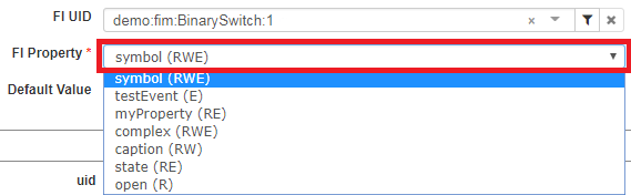
item.propertyName |
An automatically created combo-box with FI property names and their access (R- read, W- write, E- eventable), after fill of FI UID.
|
example: "symbol" The data to send is string - property name. |
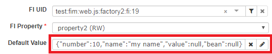
item.propertyValue |
The editor is being shown, when the selected FI property (the value of the property with context: fi_property) is writable.
|
example: {"number":10, "name":"my name", "value": null, "bean": null} The data to send is a string representation of the value. The type of the value depends on the property metadata. |
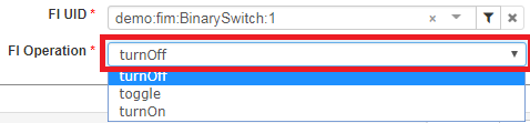
item.operationName |
An automatically created combo-box with FI operations, that comes up after fill of the FI UID field.
|
example: "turnOff" The data to send is string - operation name. |
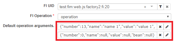
item.operationArguments |
The editor is shown, when a FI operation is selected. There may be no, or several editors for each argument of the operation.
|
example: [{"number":13, "name":"name 1", "value":"value 1", "bean": null}, {"number": 0, "name":null, "value":null, "bean": null}] |
item.attributes |
|
example: ["my key", "my value"]
|